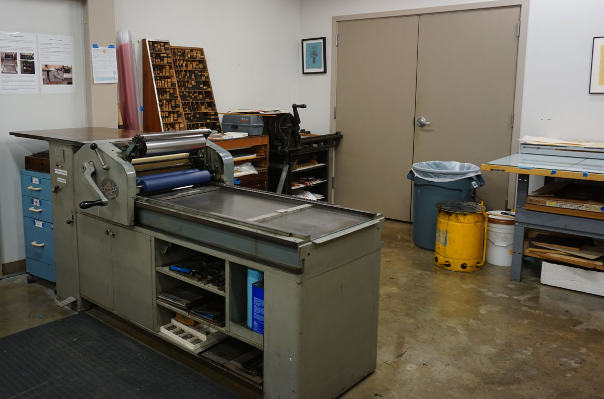
Before leaving Salt Lake City, I printed all the pages and the cover of my book Shadow Me. I was having so much fun I continued to print the pages and images for Finding Home. The books are ready to cut, fold, and assemble. It is difficult to keep a working schedule on the road. First, I don’t have much space and often the everyday activities take precedence. That’s life when it interferes with art!

© 2018 Louise Levergneux, printed pages of Shadow Me

© 2018 Louise Levergneux, printed pages of Finding Home
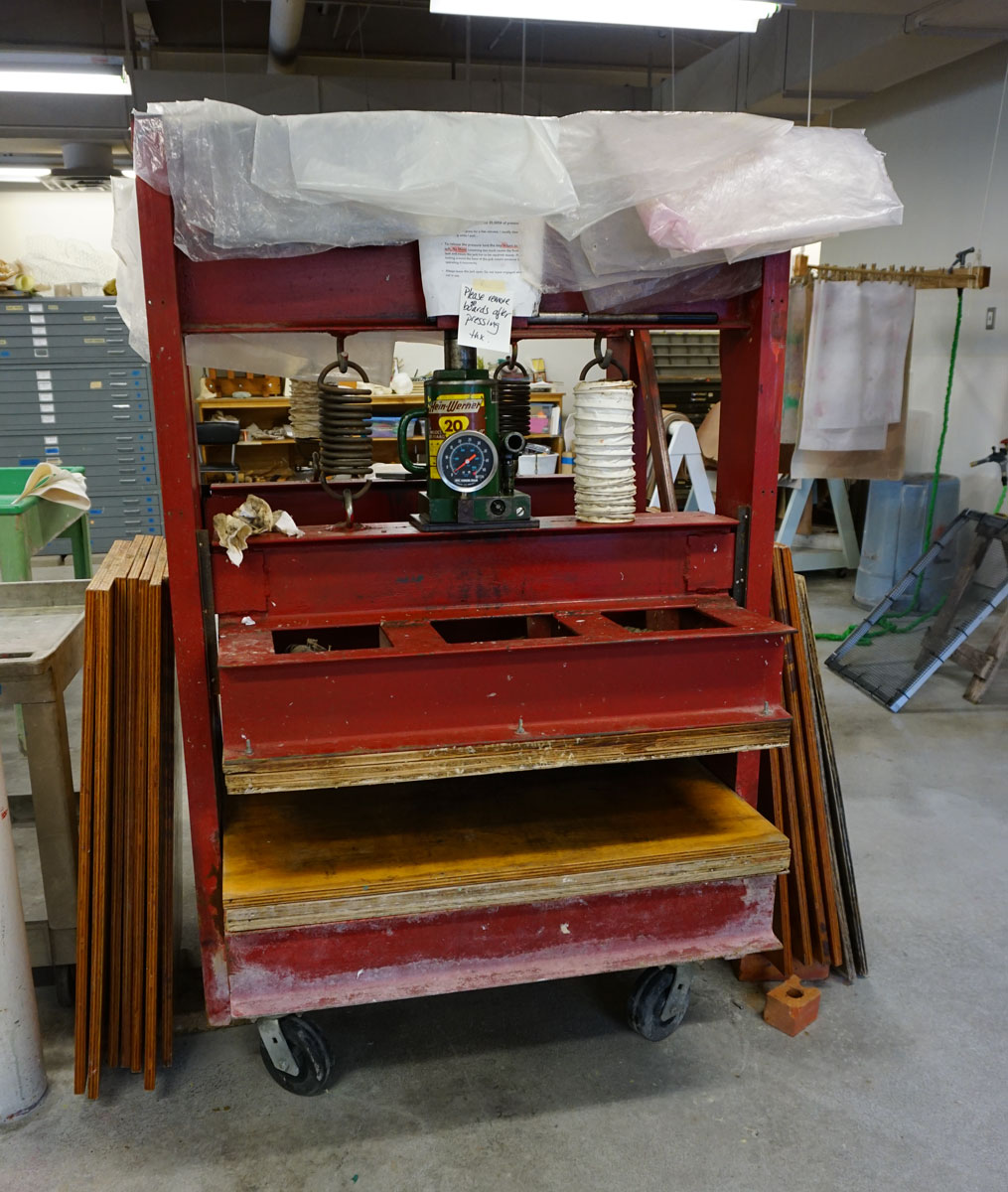
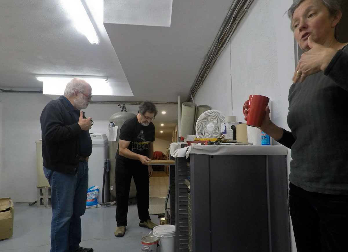
Last week, at the Book Arts Program Studio of the Marriott Library, I met with Emily Tipps, Program Manager, and Marnie Powers-Torrey, Head of the Book Arts Program and Managing Director of the Red Butte Press.

© 2018 Louise Levergneux, Marnie Powers-Torrey at the University of Utah
I had the pleasure of seeing some of Emily and Marnie's artists’ books, produced during the last few years. They also demonstrated some of the books produced by the Red Butte Press. The conversation continued by sharing thoughts on structures and techniques chosen, favourite binding methods, typestyle and fine press. The type of substrate of various books was stimulating as I’m constantly looking to print on new papers.
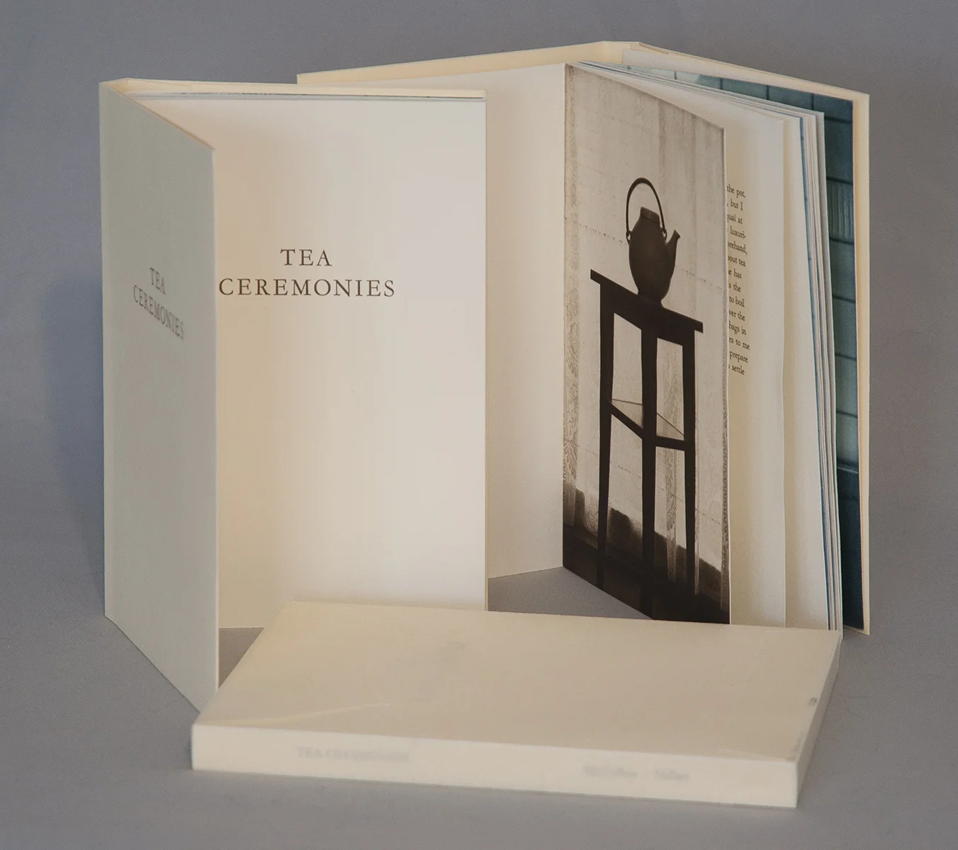
The feel of paper for the fourth imprint of the Book Arts Program (In)visible Shores by Danielle Dubrasky was very tactile, sensual to the touch. BAP imprints are designed, printed, and bound in-house.

© 2018 Louise Levergneux, (In)visible Shores by Danielle Dubrasky
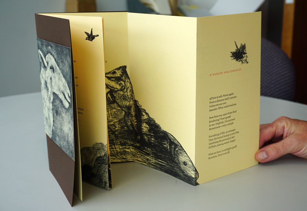
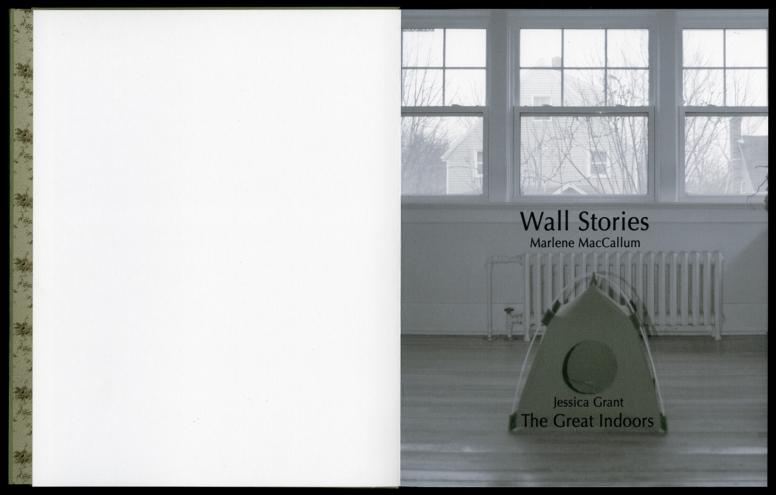
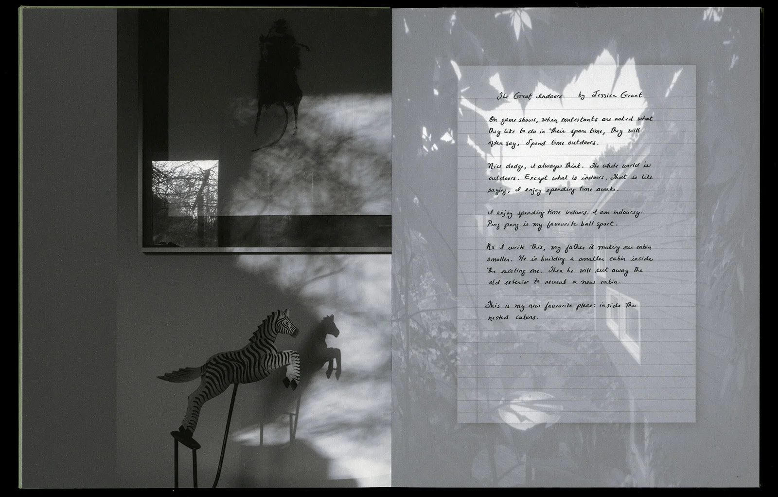
© 2018 Louise Levergneux, Stranger and Stranger by Katharine Coles The book Stranger and Stranger by Katharine Coles with images translated from the paintings of Maureen O-Hara Ure
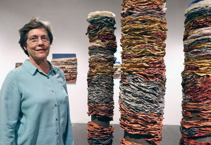
Marnie shared three of her own artists’ books. It was delightful to see Marnie enjoying the feeling of renewal through production.

© 2018 Louise Levergneux, Cities & Justice by Marnie Powers-Torrey

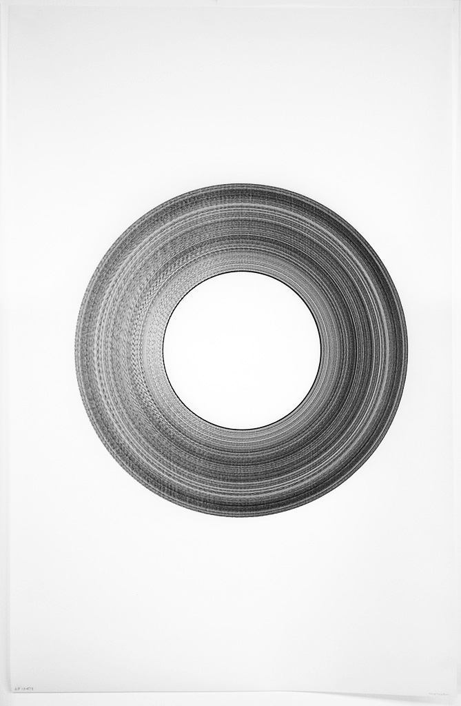
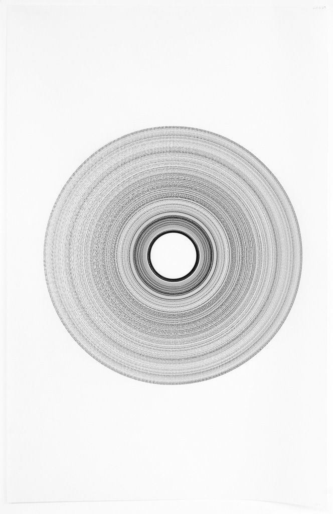
© 2018 Louise Levergneux, Nuts, Seeds & Heavier Fare (left) and Mama Self (right) by Marnie Powers-Torrey
Mama Self is an edition of 32, the age of the artist when she became pregnant and gave birth to her second child, realizing that she'd never be the same again.
Work on this book began in 2006 in a workshop with the brilliant Julie Leonard, just after the birth of the artist's third and last child. After nine years of gestation, the book was finally released into the world. Imagery is derived from circular ink washes suggesting the cyclical nature of being, the constancy of motion, revolving planets, ripe ovum and lactating breasts. The text is experimental and broken, collected in haste throughout the early years of motherhood. Stripped of formality and exposing raw, maternal femininity, the words string together a visual poem of primal and authentic language.
A short exposure with Marnie Powers-Torrey by KUEDCHANNEL7. "The visual book, as I like to call it, can be a mode of creative expression."
Emily Tipps is the founder of High5 Press. At the moment Emily has a new visual book in production with the working title of Amoral. I enjoyed the visual aspect, design, and composition of its pages.

© 2018 Louise Levergneux, Amoral, work in progress by Emily Tipps
I aim to provoke energetic reader interaction with innovative texts, using letterpress printing, hand paper-making, and bookbinding to create limited-editions whose content and form are conceptually and interestingly related. Says Emily.
The most enjoyable part of traveling is meeting old friends and artists. I’m looking forward to having a space to create and express myself through these travels. Visiting artists and getting to know the productions behind the studios are absolutely invigorating! I welcome the next encounter.