My holiday back home has come to an end. It's difficult to say goodbye but time to leave and find a more temperate climate for the winter. Our small trailer is not four seasons and not suited for the coldest season of the year in Ottawa.

© 2017 Louise Levergneux
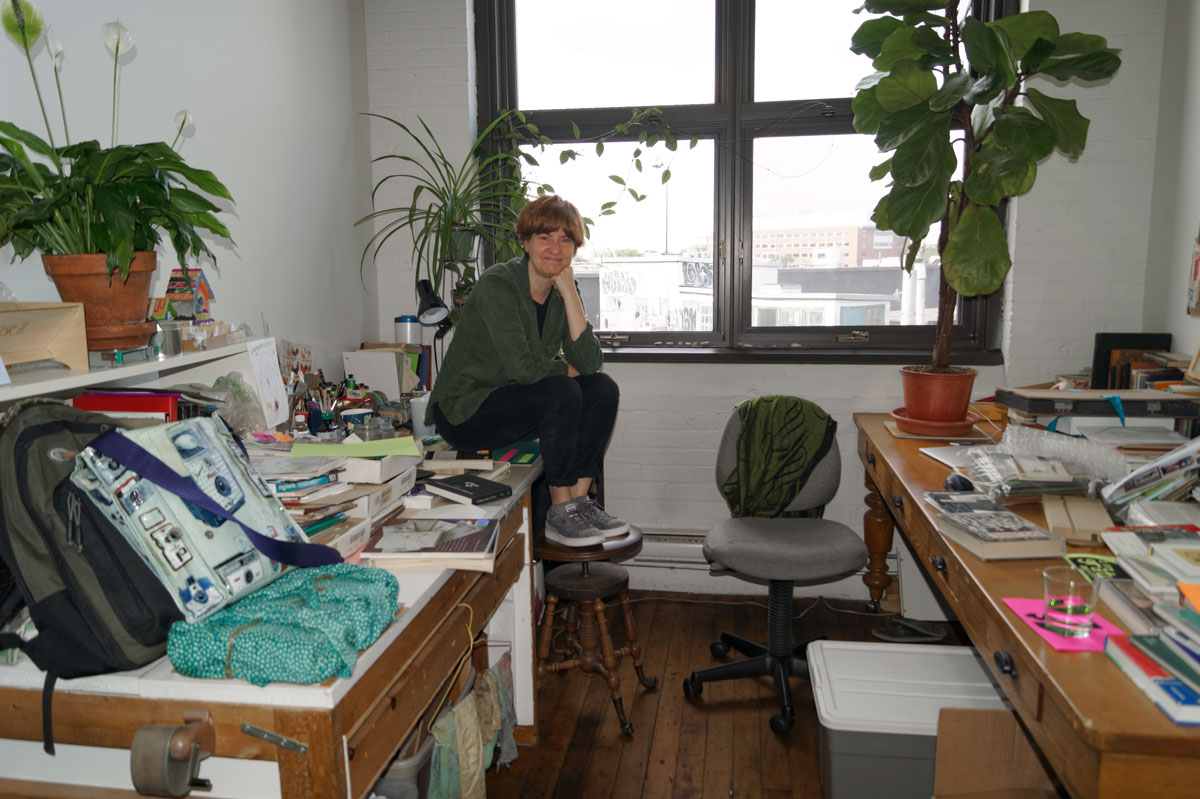
Before leaving Canada, I wanted to pay a visit to Marlene MacCallum’s studio in the south-west part of Ontario.
Marlene and her husband, David Morrish prepared a wonderful meal before taking the time to show us their studio still being built by David. After we visited the different rooms that comprise the full working area in their new home, Marlene brought some of her wonderful artists’ books for me to view and handle. What a privilege!

© 2017 Louise Levergneux, the room where Marlene binds her books

© 2017 Louise Levergneux, Marlene and David share this room where all the digital and printing is done, the red cover protects a really big printer, NICE!

© 2017 Louise Levergneux, press room is in the works
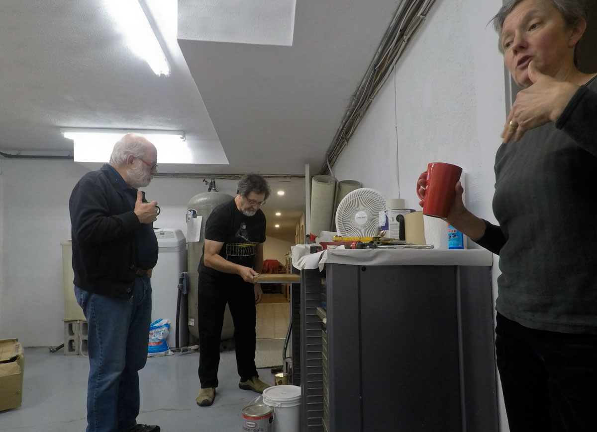
© 2017 Louise Levergneux, David showing drawers of many typesets while Marlene talks about her artists' book "Nine Elevated Views". You can view this book on my post dated May 21st.

© 2017 Louise Levergneux, one of the press studios
Marlene uses photogravure, a historical photo/intaglio process that dates from 1879. Marlene’s chosen media plays a large role both in the way it translates the subject and in the effect of the presentation.
The interaction of ink and paper with its tactile and physical presence bring to mind a state of photographic memory which can be felt in Marlene’s books and subjects.
The visual interpretation of personal domestic space and the ordinary stuff of daily life has been the consistent pursuit of my practice. I am fascinated by our relationship with the spaces that frame and objects that fill the majority of daily lives, and yet, are overlooked as we move through our daily routines in a state of inattentional blindness.
I begin by making photographic records. A visual occurrence that startles me out of my routine relationship with objects and spaces prompts the image choice. The gathering of images results in a visual archive of the ephemeral moments linked by a sense of the uncanny or a spatial déjà vu. Drawing on this source, I then build suites of prints or artist’s books that offer the viewer a sense of the strangely familiar.
The artist’s book affords me the opportunity to integrate a variety of printing methodologies and sequential structures in a form that provides the viewer with intimate interaction with the work.
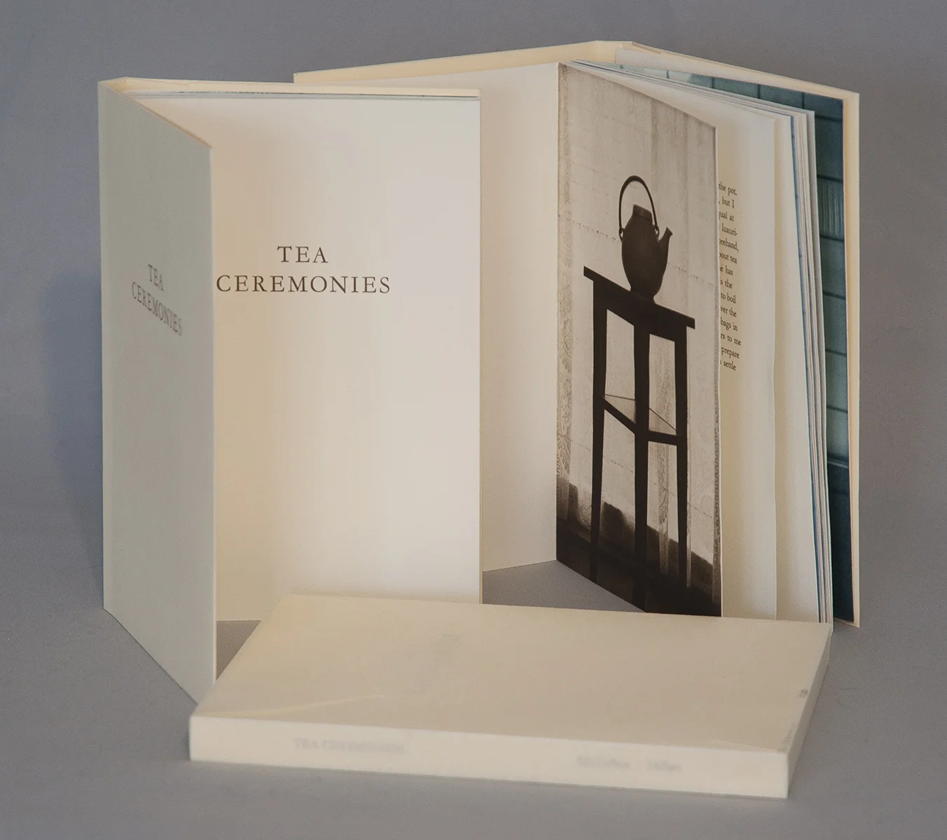
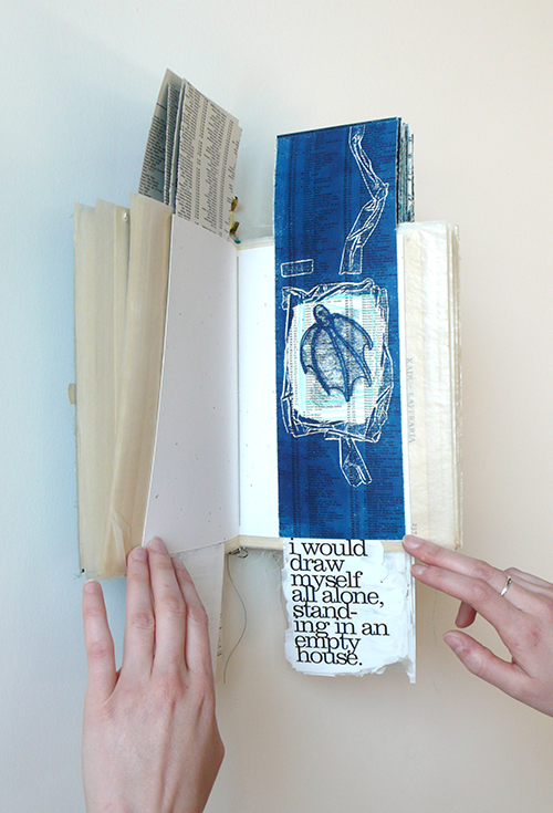
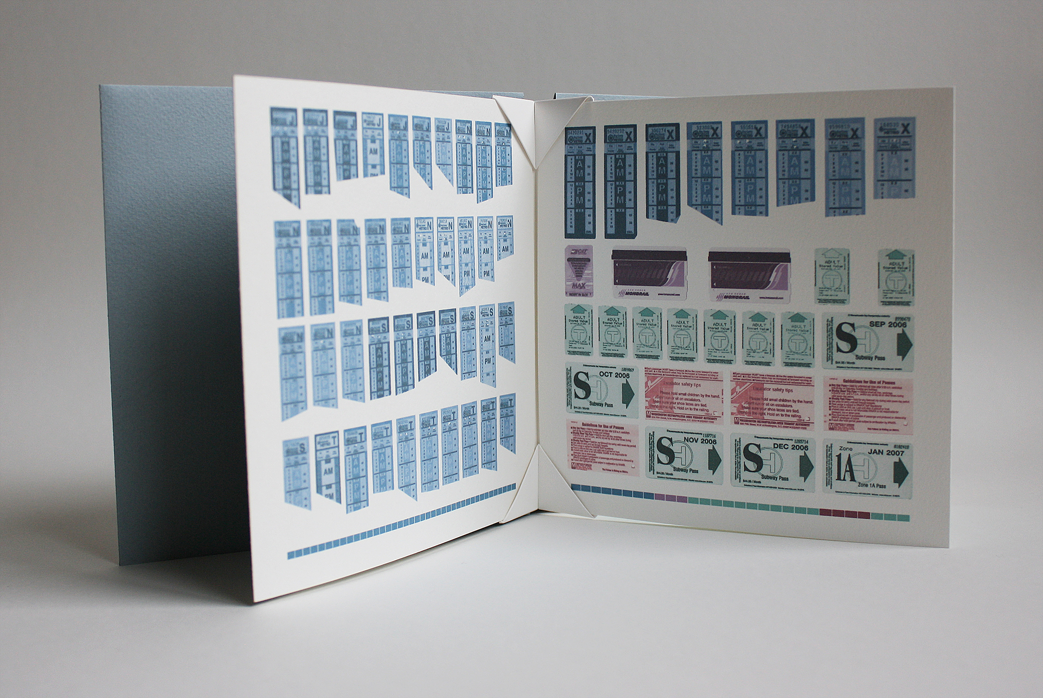
© 2016 M. MacCallum, Tea Ceremonies, (text by Matthew Hollett), hand-bound accordion artists' book with folded paper cover and wrapper, images printed in photogravure and lithography, text printed in letterpress

© 2016 M. MacCallum, Tea Ceremonies, view of the third-page spread, 19.5 x 13.1 x 1.5 cm (closed dimension), 19 x 25.4 cm (page spread)

© 2016 M. MacCallum, Tea Ceremonies, view of the ninth page spread
Tea Ceremonies is a collaboration with Newfoundland artist and writer, Matthew Hollett. The piece began with Matthew’s text and I created an image response and designed the book layout and structure.
This work celebrates everyday rituals and small ceremonies. The piece explores repetition and sequence in its use of layered text paralleling the way everyday activities leave residue. Text, photogravure images and lithographic tea stains interact in counterpoint throughout the sequence of the book. residue. Text, photogravure images and lithographic tea stains interact in counterpoint throughout the sequence of the book.

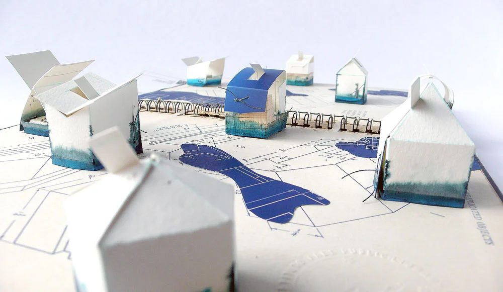
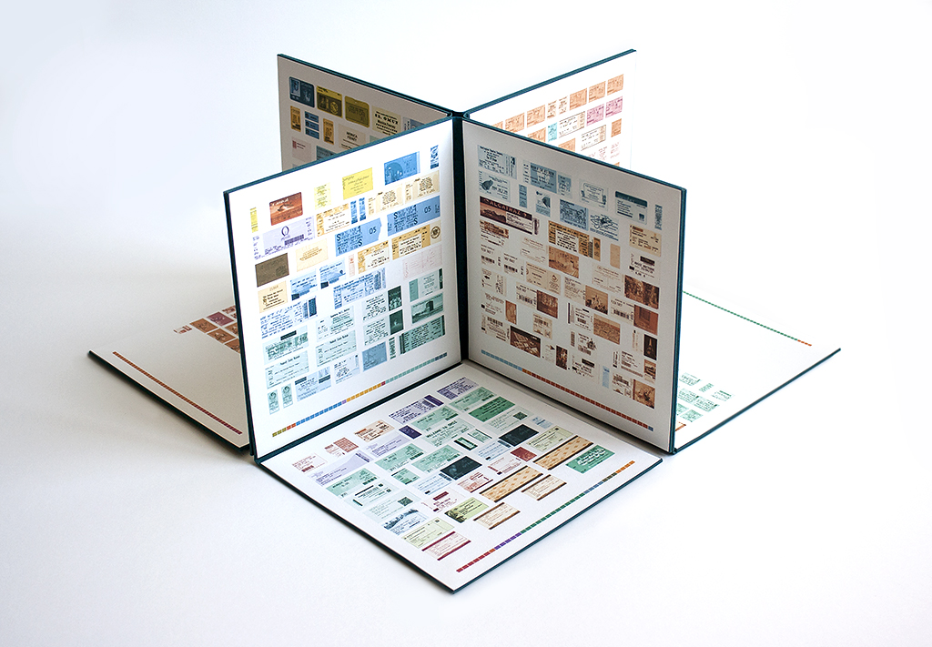
© 2014 M. MacCallum, Wall Stories, (text by Jessica Grant), hand-bound accordion book work, view of installation at The Unfolding Narrative at the Parrott Art Gallery in Belleville, Ontario
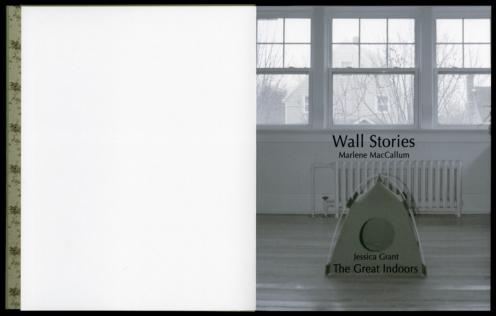
© 2014 M. MacCallum, Wall Stories, dust jacket, inkjet on Digital Aya paper, view of title page, 26 x 20 x 1.2 cm (closed dimension)
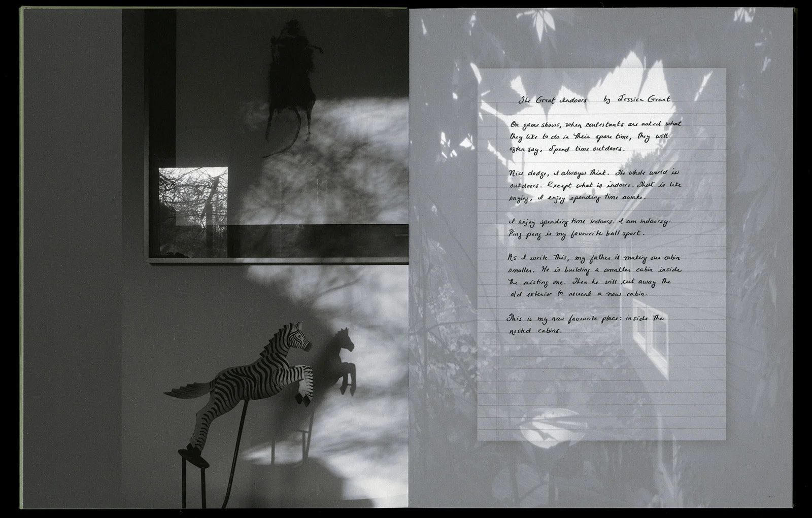
© 2014 M. MacCallum, Wall Stories, view of second-page spread, 25.6 x 39.3 cm
Wall Stories is a collaboration with Newfoundland writer Jessica Grant. This piece brings a different perspective to my examination of everyday spaces. Jessica’s text, The Great Indoors, and my Townsite home images interact to create a celebration of interior life with special attention to the collection of objects and the adornment of surfaces. Elements of the external world are miniaturized and nested within living spaces inverting the inside out logic of homes. The first iteration of this collaboration was published by the Journal of Artists’ Books as part of the artists’ project Switching Places.

© 2013 M. MacCallum, Corner a handbound accordion book with slipcase, the structure is held closed into a codex form by sewing across the spine into the end pages. 26.1 x 13.2 x 2.4 cm (closed dimension)

© 2013 M. MacCallum, Corner, front and back end pages slip into the cover pockets, the book block is printed in photogravure on Somerset paper and the cover is inkjet on coated Tyvek

© 2013 M. MacCallum, Corner

© 2012 M. MacCallum, Theme and Permutation, hand sewn pamphlet, images custom-printed in offset lithography on Mohawk Superfine, text printed in inkjet, covers are inkjets printed on translucent Glama, 23.5 x 21.6 x .6 cm (closed dimension)

© 2012 M. MacCallum, Theme and Permutation
Theme and Permutation is one of a series of artist’s books inspired by the experience of living in Corner Brook’s Townsite area on the west coast of the island of Newfoundland.
Between 1924-34 the pulp mill built 150 homes to house the mill management and skilled or to highly renovated. This project gave me the rare opportunity to record the evolution of interior aspects of these homes. It has been the context to explore the paradoxical phenomena of conformity and individualization that occurs in a company town. Having grown up in a suburban housing development, my earliest memories of home is that of living in a space that is reminiscent of my neighbors’. Each artist’s book explores a distinct facet of image memory, multiplicity, sequence and offers the viewer a visual equivalence of the uncanny.
Theme and Permutation is a response to the permutations and variations of the type-4 Townsite House. Digital tools were used to translate the original film source of eight different window images from five houses. The sixteen offset lithographic plates were custom printed in twenty-nine separate press runs. Each image is the result of a different combination of plates. The structure is a sewn pamphlet with translucent covers. The viewer enters the body of the book with a tritone image of a single Townsite window. As one moves into the piece, new window images appear and layer over each other. The images become darker and more heavily layered towards the mid-point. The center spread has an inkjet layer of two text blocks printed over the offset litho images. The text speaks of the history of the homes, the architectural permutations and economic shifts within the Townsite area. The ensuing pages continue to provide new combinations of window layers, gradually lightening in tonality and allowing the individual windows to become more distinct. A third text block provides a personal narrative. The piece concludes with a tritone image of one of the Townsite windows in original condition.
I don’t have time or space to create these days being on the road, but this time in my life is wonderful, I enjoy meeting and reading first-hand amazing works by artists’ bookmakers around the country.
I will be in Austin, Texas for most of the month of November. If you know about my new my journey and would like to introduce me to your work.
Let me know, I would love to visit your studio !